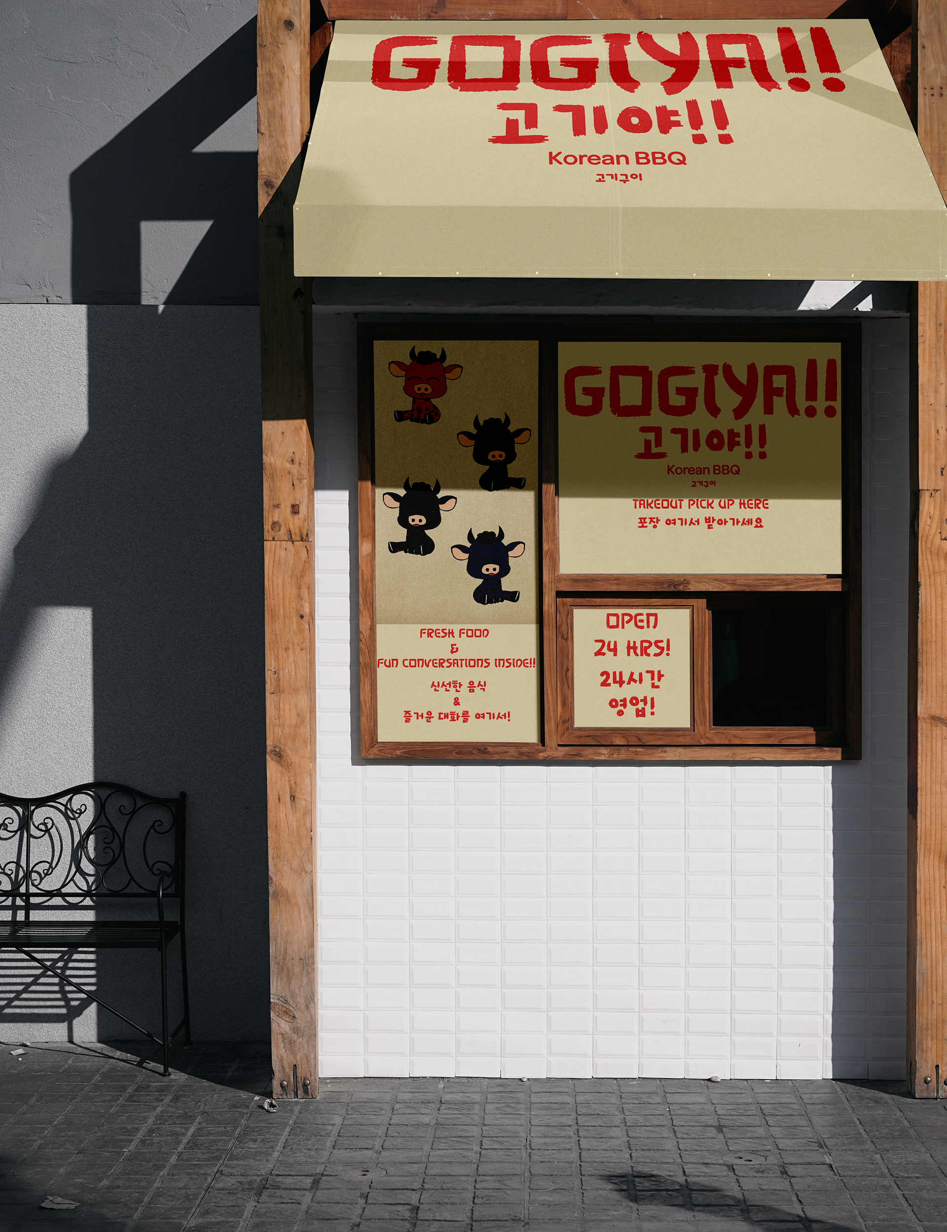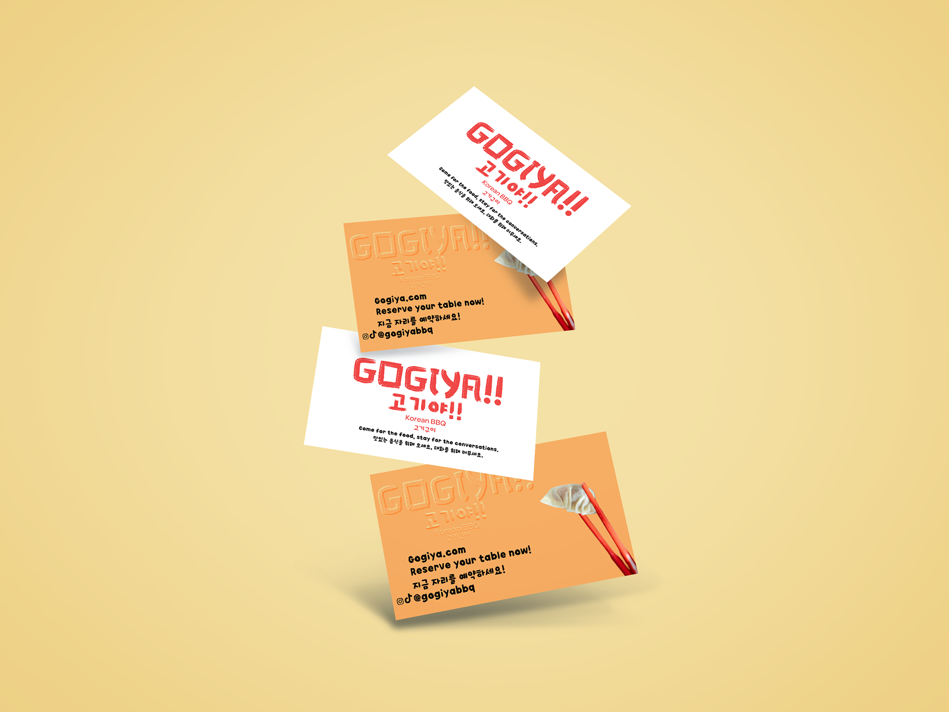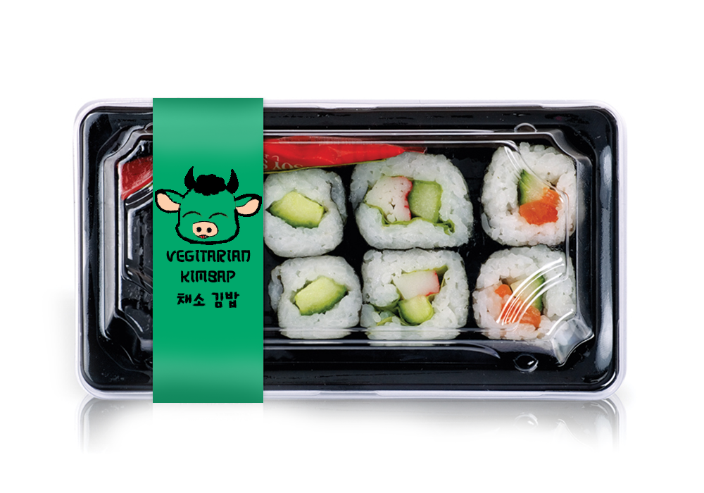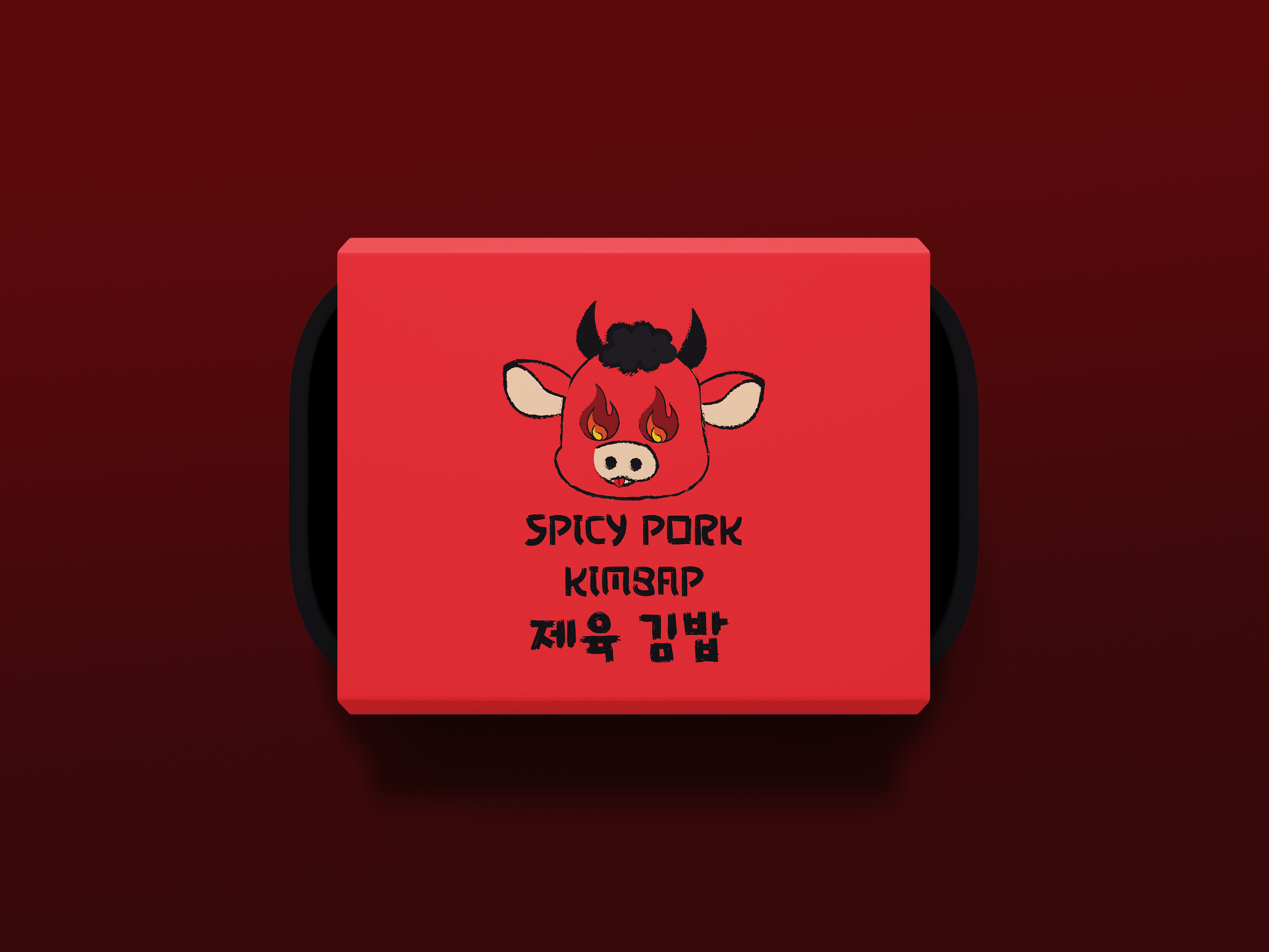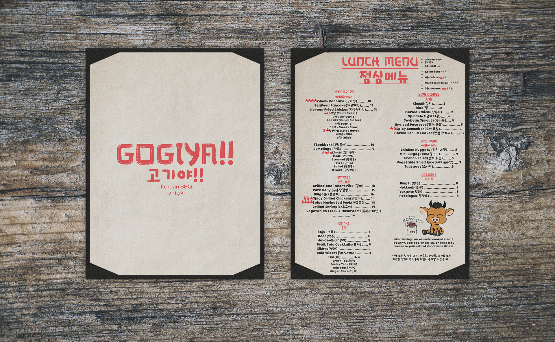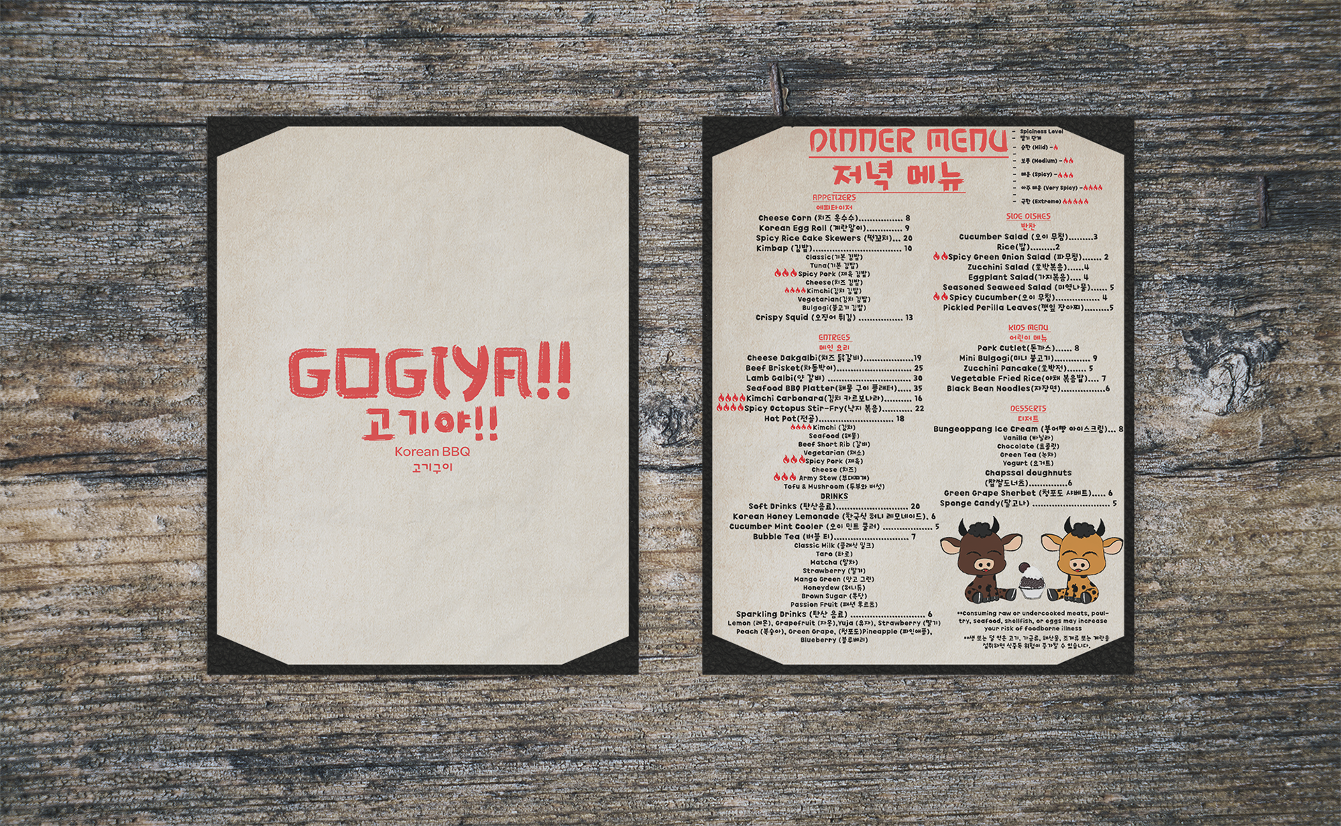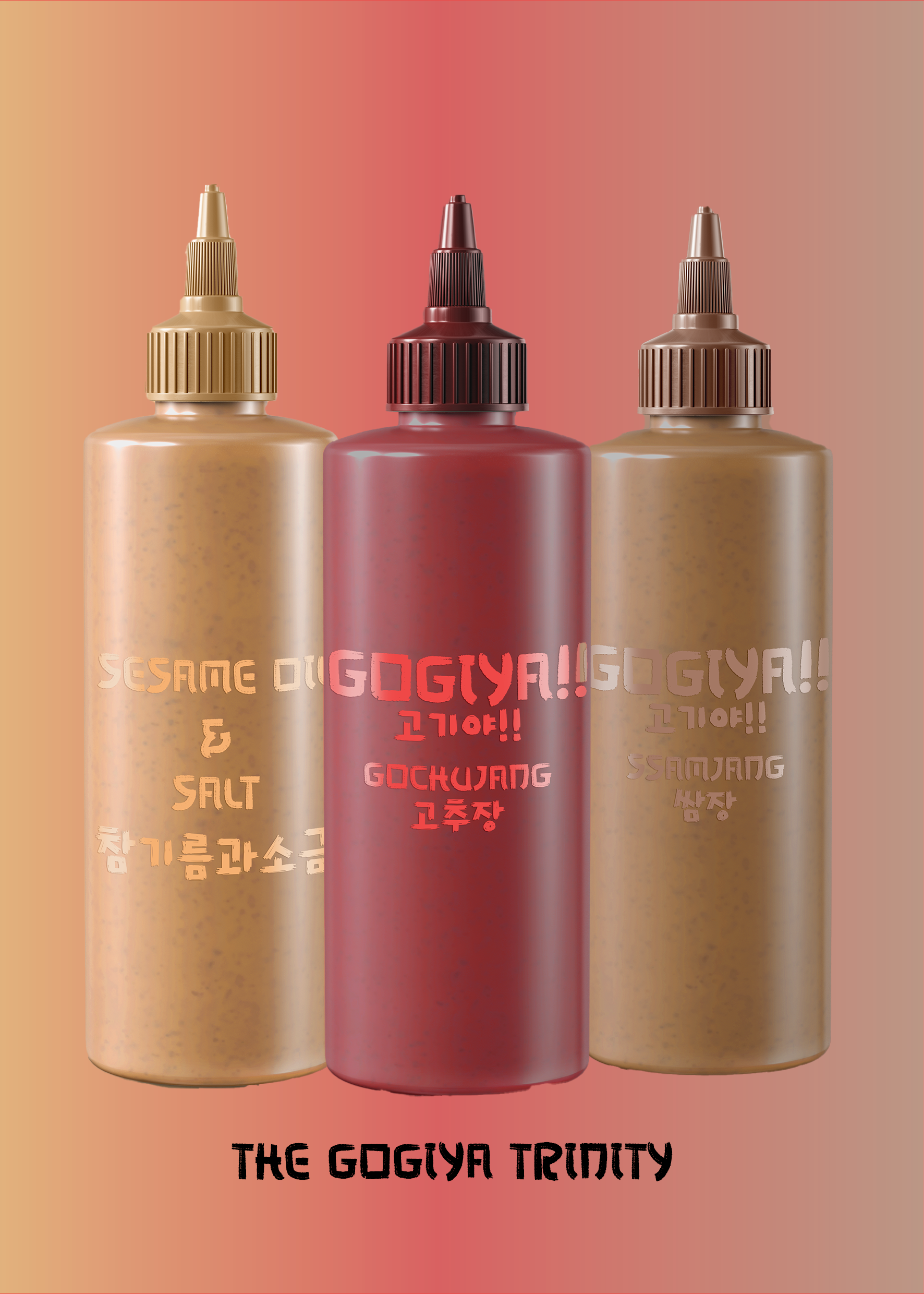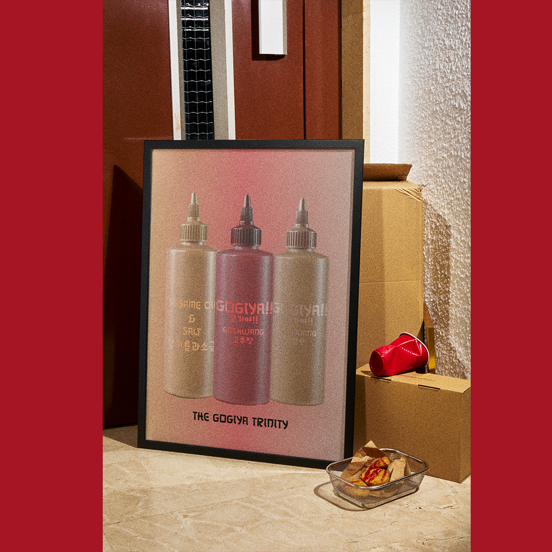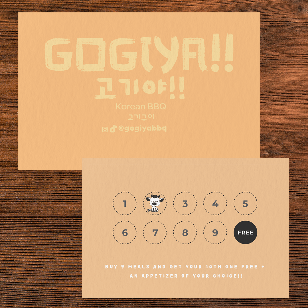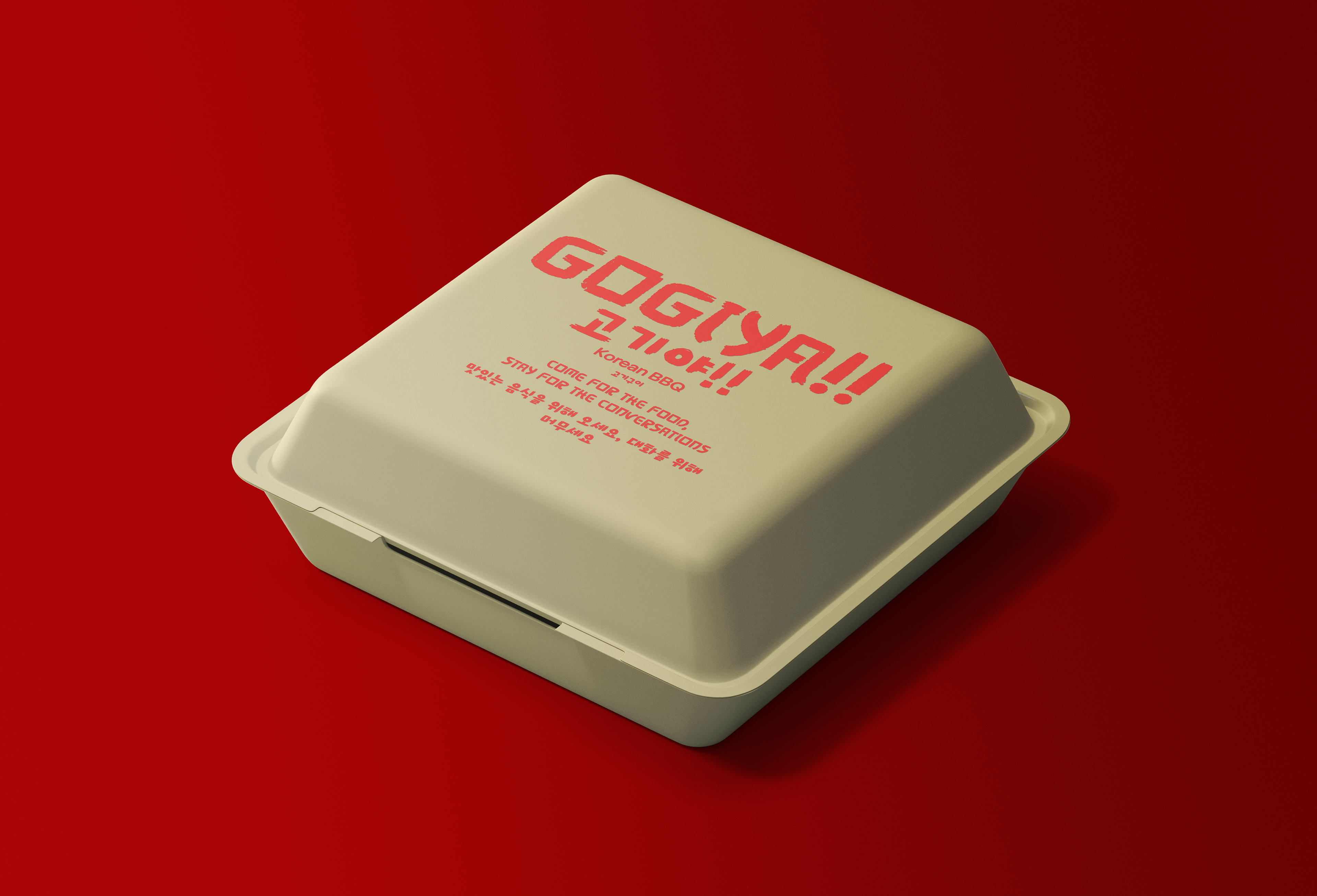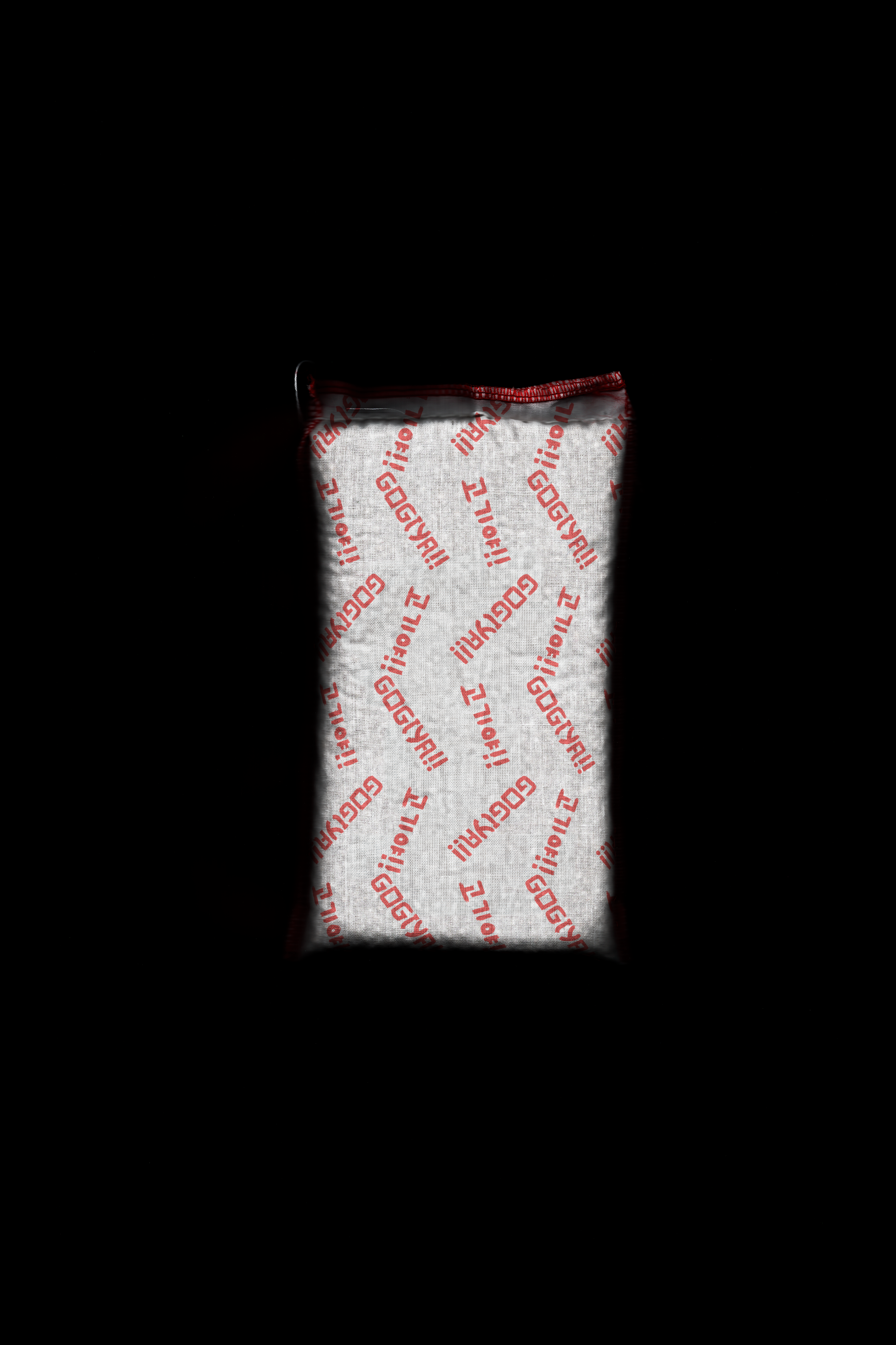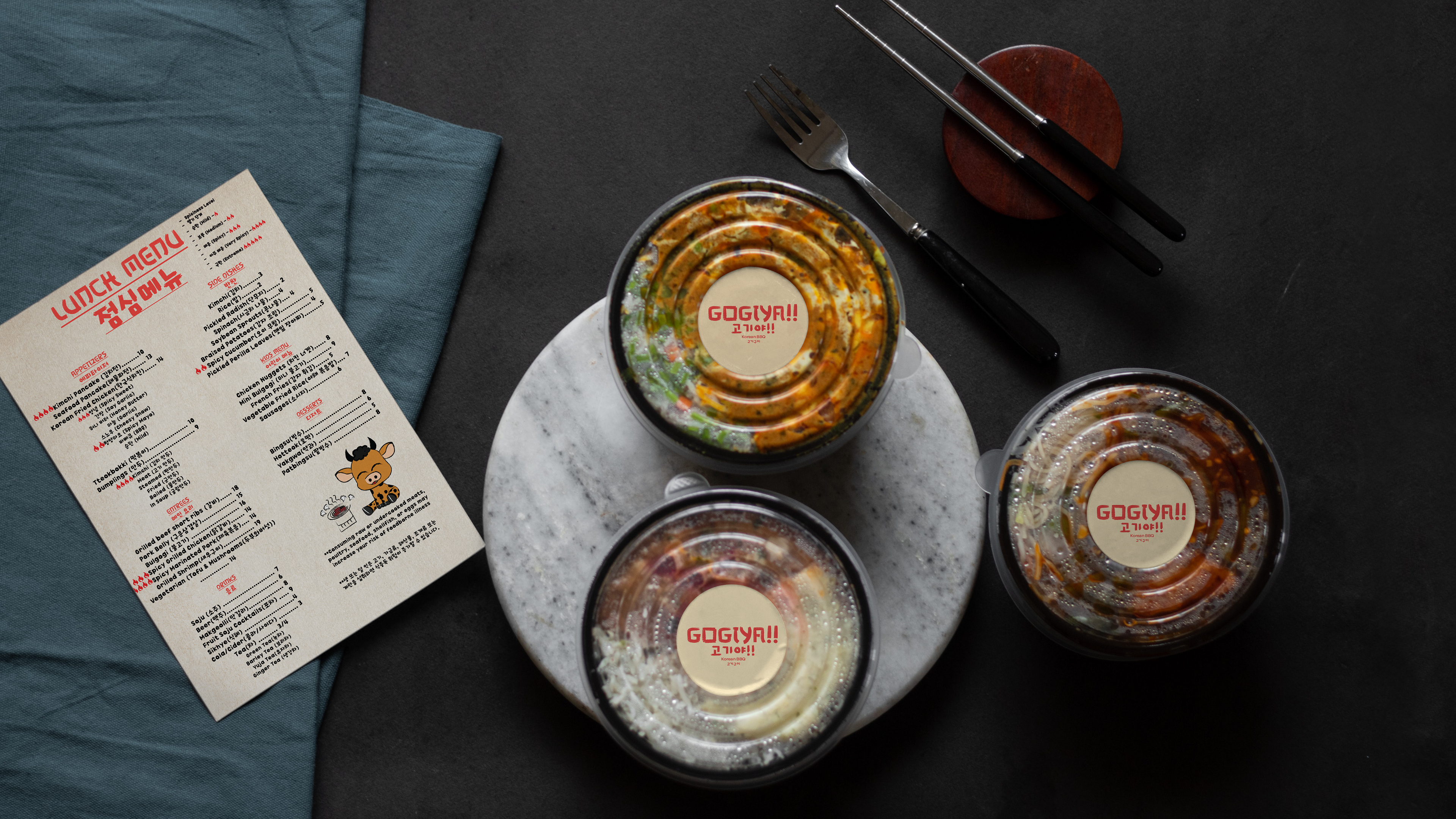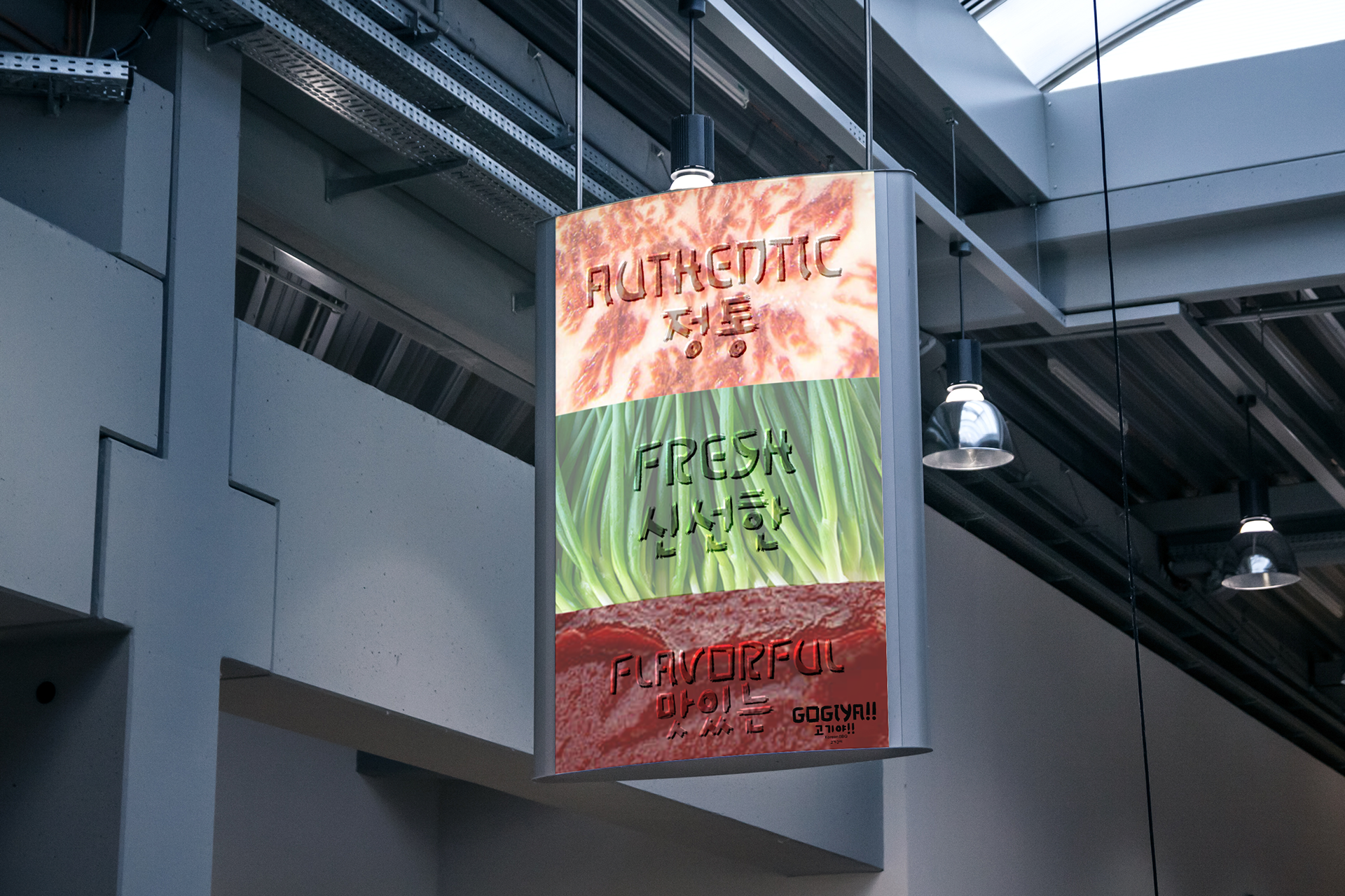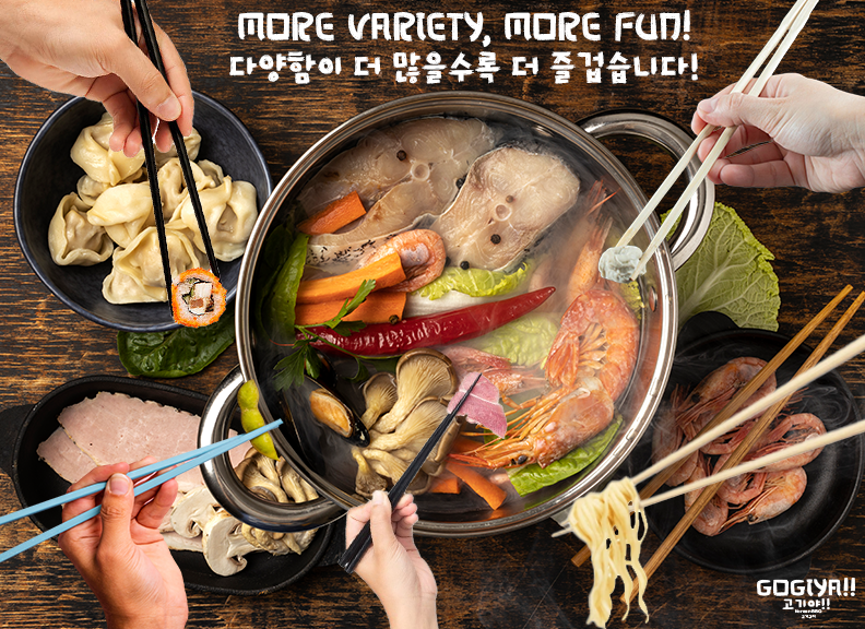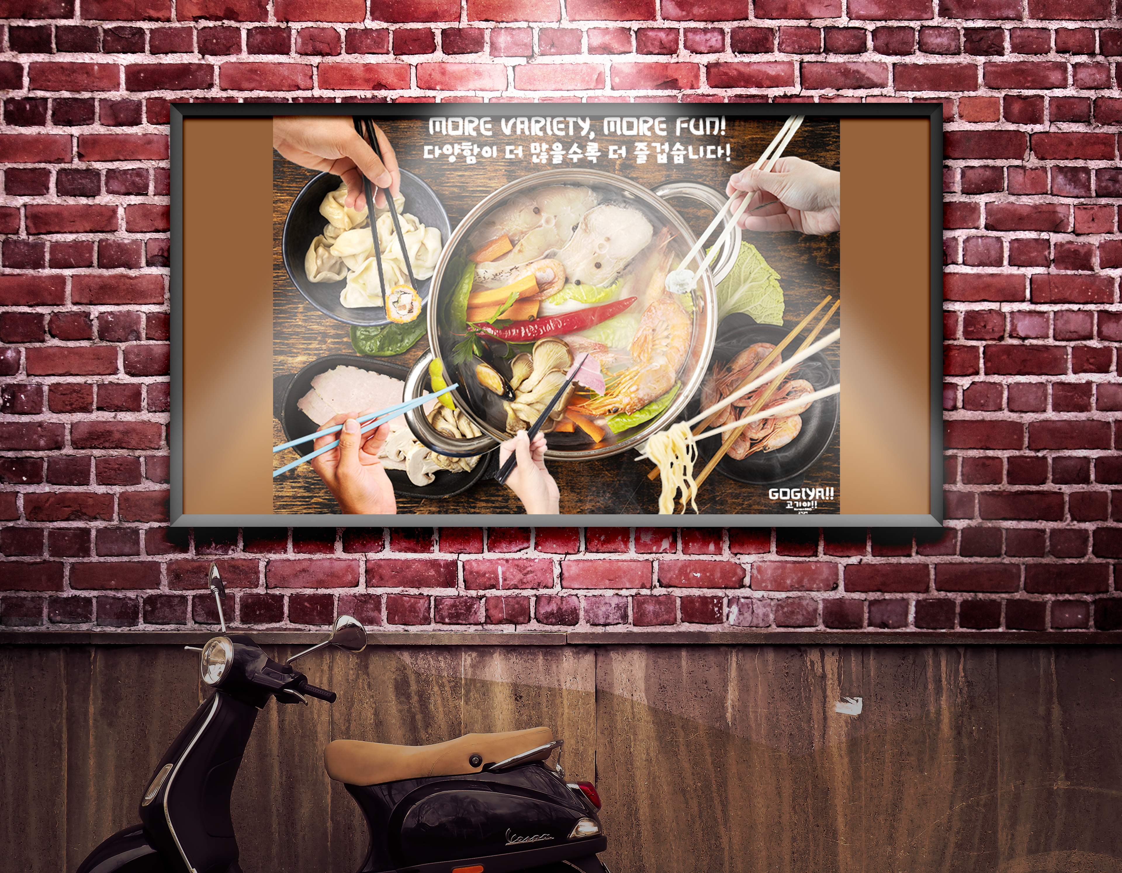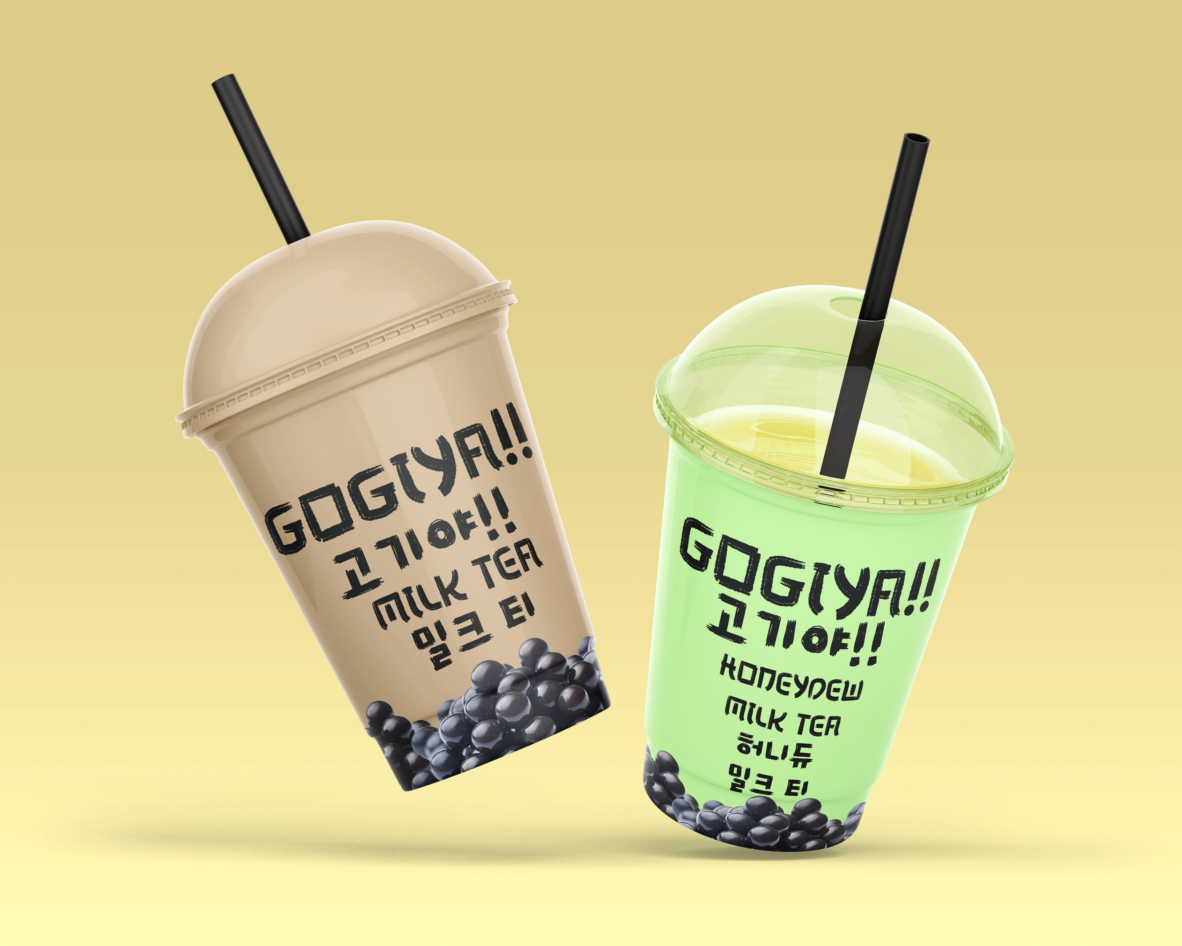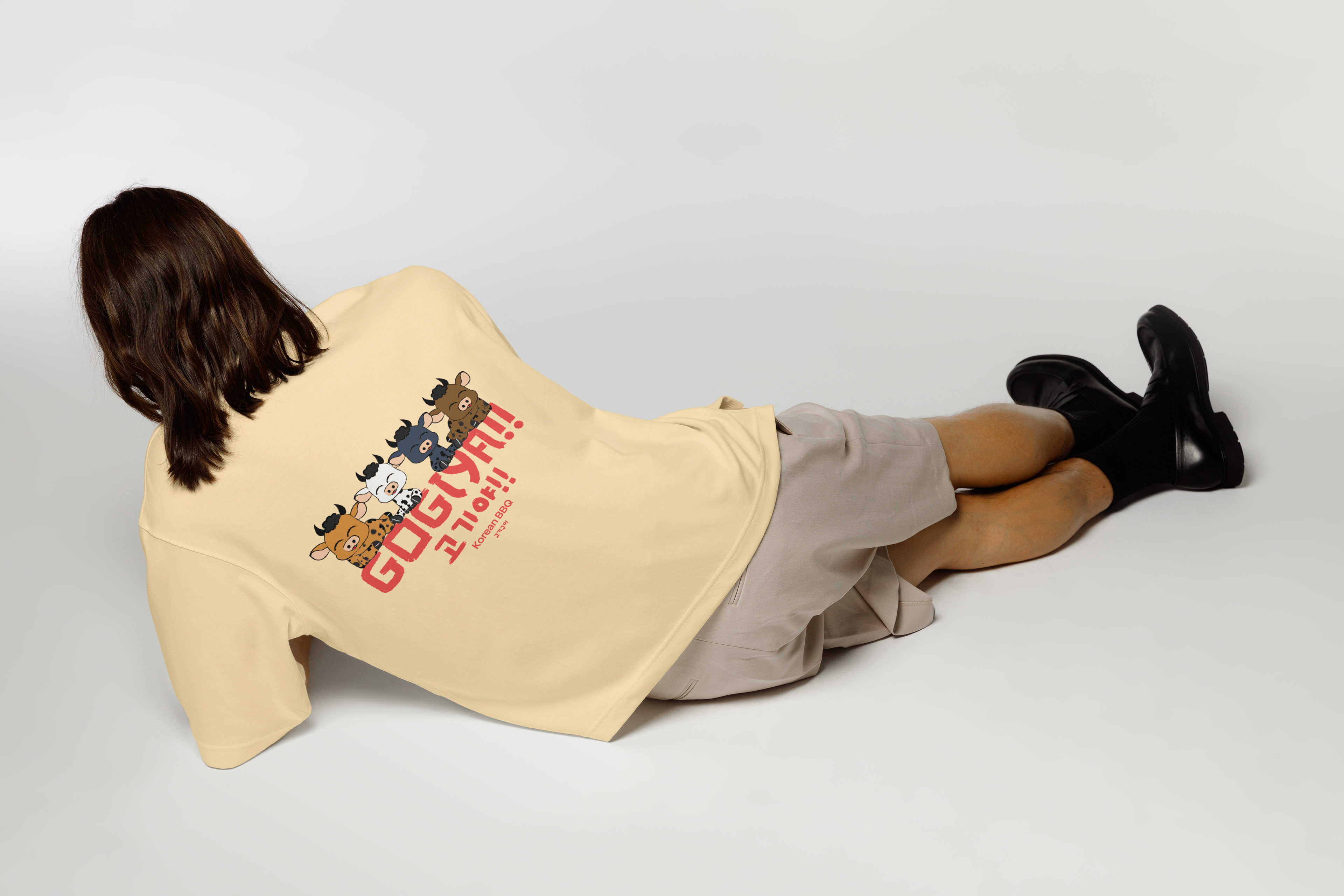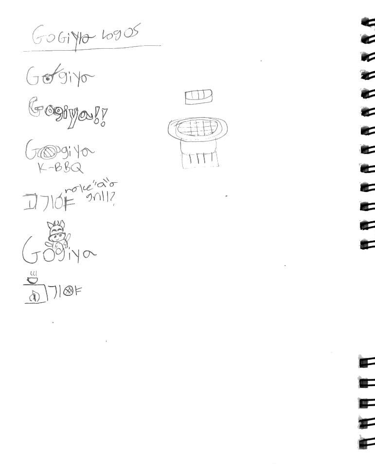
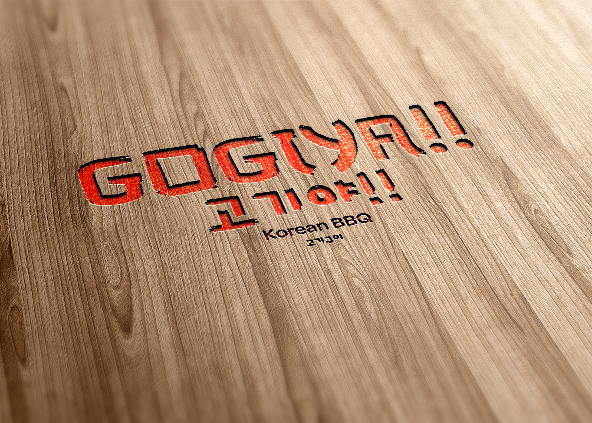
Introducing GOGIYA!! a fusion Korean BBQ restaurant where good food and conversations collide. When creating the logo and branding, I wanted to test out multiple concepts whether around food or grilling, but instead of these ideas, I decided to do research on Korean graphic design, and that is when i realized how important typography was to the culture. Thus for my new idea, I was inspired by Korean calligraphy, and the Zyukiharu typeface looked similar to letterforms in the Korean Alphabet, hence I used it for the final logotype version on the right. I also added exclamation points to my logotype, as the word "gogiya" to me not only sounded like a playful saying, but like a cheer you would say over a toast at a dinner. Which would fit for a conceptual restaurant where not only food is the star, but so is the social environment. To add on to the playfulness, I made a logomark character, a hanwoo cow, a cow ironically used for beef, which also correlates to the restaurant theme. Other branding ideas that I did was packaging, a loyalty card, posters and labels to name a few.